timebox.so teardown
This post is a teardown of timebox.so, a todo list app that I recently spotted on Reddit.
I'm doing the teardown because there was a lot that impressed me in the product presentation, and I want to capture my takeaways. This is a learning exercise and set of notes for me to look back on if I ever launch a product - and hopefully a helpful real-life example for you!
My first thought on hitting the website was "good job". I was instantly impressed by:
- The ICP (ideal customer profile) focus, and the super-consistent messaging based on it.
- Clean feature presentation.
- The availability of a demo.
ICP
The app creator, Rohan, wanted to make a todo app specifically based on Cal Newport's productivity insights.
After filling up notebooks with timebox schedules and struggling to locate past entries, I wanted a digital solution. Finding none that were affordable, subscription-free, and aligned with Cal Newport’s method in his physical Time-Block Planner, I decided to create timebox.so! (source)
As well as being the focus of the app, this provided the ICP: other Cal Newport and timeboxing fans. Every aspect of the website copy ties back to this.
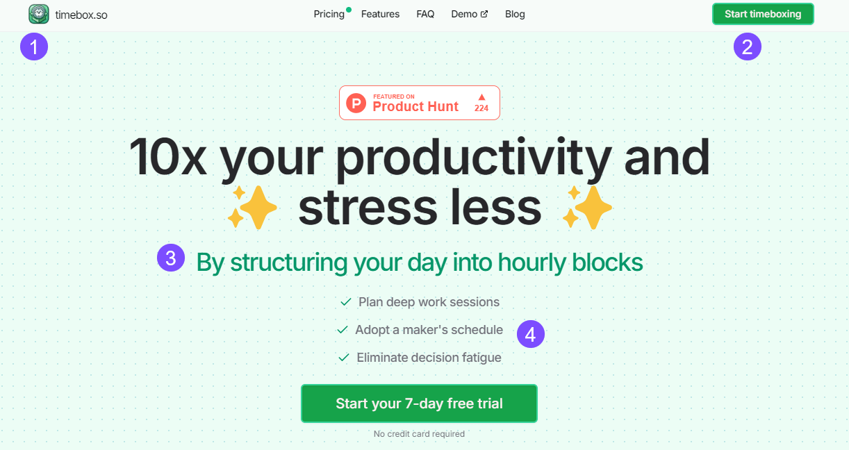
In the above screenshot:
- The app name and website URL: timebox. It's instantly clear what the app is about.
- A CTA (call to action) reading Start timeboxing. Again, clear what you're here for.
- The subheading reads By structuring your day into hourly blocks - another tight focus on timeboxing and timeblocking.
- The three highlighted benefits of the app hit key terminology, including "deep work" and "maker's schedule".
The ICP focus continues with quotes scattered down the website that reenforce the value of timeboxing.
Feature presentation
So many product websites make it hard to see what the product actually does. timebox.so allows the product and its features to shine.
The homepage feature section describes what you can do, with real product screenshots. In six visually clean boxes, you get a great summary of the app's functionality.
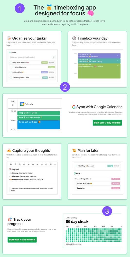
In the above screenshot:
- Another reenforcement of the "timeboxing" and "focused work" message.
- Clean boxes with actual screenshots of the app, not diagrams, icons, or graphics.
- Somebody knows they're talking to a dev audience . . .
Demo
If you want to really get a feel for the app before signing up, you can then try the demo. I'm not sure why more products don't do this? As a potential user, it's great to be able to see the actual interface and get a feel for the controls. For example, testing how drag and drop feels.
Professionalism
Rohan seems adamant this is a side project, not the start of a full-time business:
But in terms of scale I never want this app to get too huge for exactly that reason: cost. So I think I'll either just cut off purchases / sign ups after a certain point or raise prices incrementally (source)
However, the website includes an FAQ that actually answers likely common questions, a privacy policy (including a GDPR email contact), feature comparisons with a competitor, and the beginnings of a blog.
Any criticisms?
Yes:
- Where is my scroll bar? I want it back.
- A couple of accessibility fails: in particular, green-on-green is always going to cause contrast problems.
- According to Lighthouse, the page is blocked from indexing. Maybe he really doesn't want customers? But then why the blog post and Product Hunt launch? If I had to guess, I'd say this is probably an oversight, not a deliberate choice (I may be wrong).
Wrap up
Am I going to buy? Maybe. A one-off $24 fee is tempting. I don't usually timebox, but I'm wondering if this would be interesting for work (although I couldn't sync work data into an external app, so I'd have to manually recreate my calendar). I haven't gotten into the app design in this post, but I like it: it really does what it says it will in terms of focusing on timeboxing, but it also provides a notes space that appeals.
What gives me pause? The privacy policy discloses that he uses Posthog, and given how much that can record, its usage means potentially zero data privacy. I might keep chipping away at my own todo app for this reason.
But overall: cool app presented amazingly well. That ICP focus is 🤌